I love this unit! The students are asked to take points of inspiration from their favourite photos of home. They then had to translate these into additive or subtractive textures in the clay. These houses are a fun construction that the students love too. Here are some GIFS to show their various Facades.
Impressions of Home
So, as the clay room was too warm (or this batch of clay was different to the last batch) the students in semester 2 could not join their facades to make a their house. This meant that we had to figure out what to do with their awesome work. As the students were already on to the second unit, it meant that I had to find something that was easy enough for me to do without them, that wouldn't take away from the identity of their work. I wanted to bring out the texture on the facades, but not paint them. Online research and help from Aidan Hammond (an inspirational colleague who has a background in ceramics and then transitioned into the design department), I decided that it would be best to use Iron Oxide rub.
|
|
Jeju is a beautiful small island off the coast of South Korea. It was once full of tradition and heritage with a real spiritual side. It was Korea's honeymoon island, the place that all South Korean couples would travel to learn about each other.. There are certain sculpture parks to educate on the idea of 'love'.. but I digress.
Jeju is a volcanic island, full of the most beautiful igneous rocks. All over the island they are seemingly procasiously used to create walls and Cairns. These rock piles are not unique to Jeju though, they are present all over the world and the unit begins by comparing the Cairns from two different places in the world. We then explored the work of the land art movement and developed our own Cairns to show an adjective.
The Cairns were drawn on a REALLY large scale (upto 1m x 60cm) using grids in Maths.
The focus was on Tone, Texture and Form using chalk pastels. Messy but beautiful.
At parents evening I was thanked for giving the students an opportunity to learn and look at themselves more. I was under the impression that this was something that was inherent in art education, but apparently not in Korean education. This explained why they struggled to consider themselves in this way.
They were able to produce some nice outcomes, but I will look forward to improving this in the coming year with the next group. They were not ready for paint and should have explored shadow, form and colour in more detail. Next semester I will adjust to accomodate this.
They were able to produce some nice outcomes, but I will look forward to improving this in the coming year with the next group. They were not ready for paint and should have explored shadow, form and colour in more detail. Next semester I will adjust to accomodate this.
Grade 7 BHA: Jeju South Korea
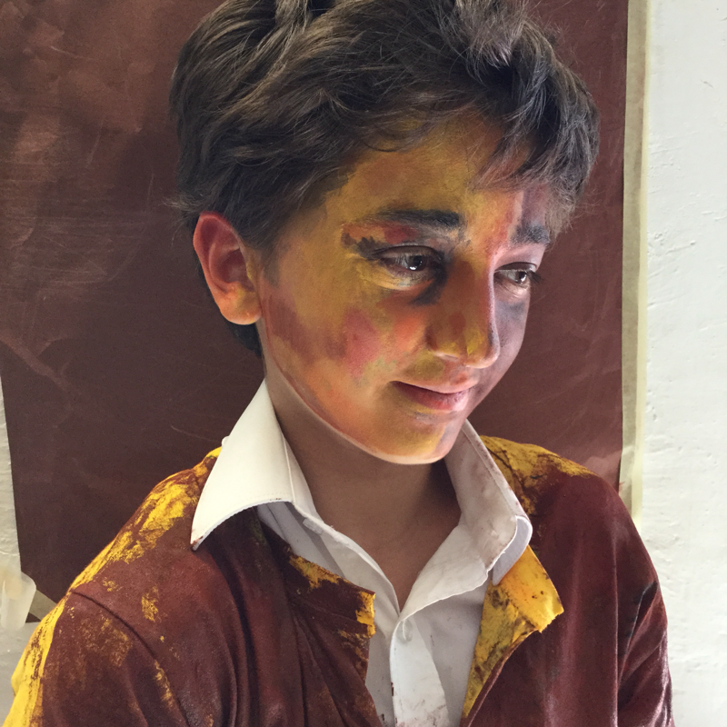
SEMESTER 2 Chiaroscuro Drawing
I love that I have a department that supports each other. I asked my colleague, Jessica Wallace, what she thought iI could do to improve my students perception of form and tone in the portraits. This was a task that she had used in her elementary grade 5 class to help the development of this same skill, but this was a really cool thing to transfer.
So: To help the students understand how to create the illusion of form in their portraits, we had to look at the application of highlights and tone. We did this by covering a piece of paper in black charcoal first, we then erased the highlights. The students were reminded that they were not looking for the facial features, instead picking out the areas that were lightest and darkest and trying to match them.
Watch this video to see how I did it.
The forgiving nature of the charcoal was really successful in this task. They could really see the faces emerging from the black, and any mistakes were not permanent, they can be erased and redrawn again.
Some of the pictures I took of the tone on their faces were better than others to work from as not all were fully front facing and the challenge of proportion too was too great. .
Forgery Factory
|
After discussing forgery and the role of originality in art, students were asked to complete a copy of the work of the posrtraits they were ingested in. I gave them all a certificate after of valuation after. (So a6 on the scale of 1-8 would get valued at $6,000,000). They loved this task and found it really good fun.
I was impressed with their outcomes |
|
Grade 9 Ormskirk School: Liverpool, England
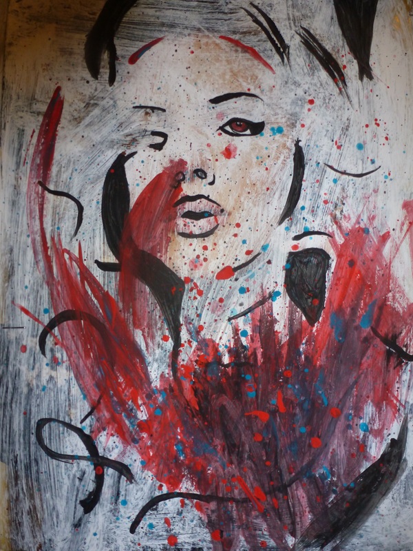
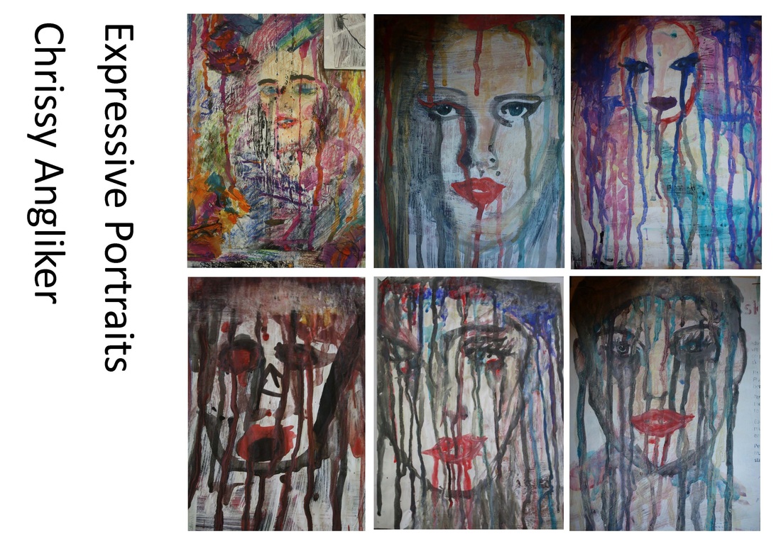
Expressive Portraits Inspired by Russ Mills and Chrissy Angliker
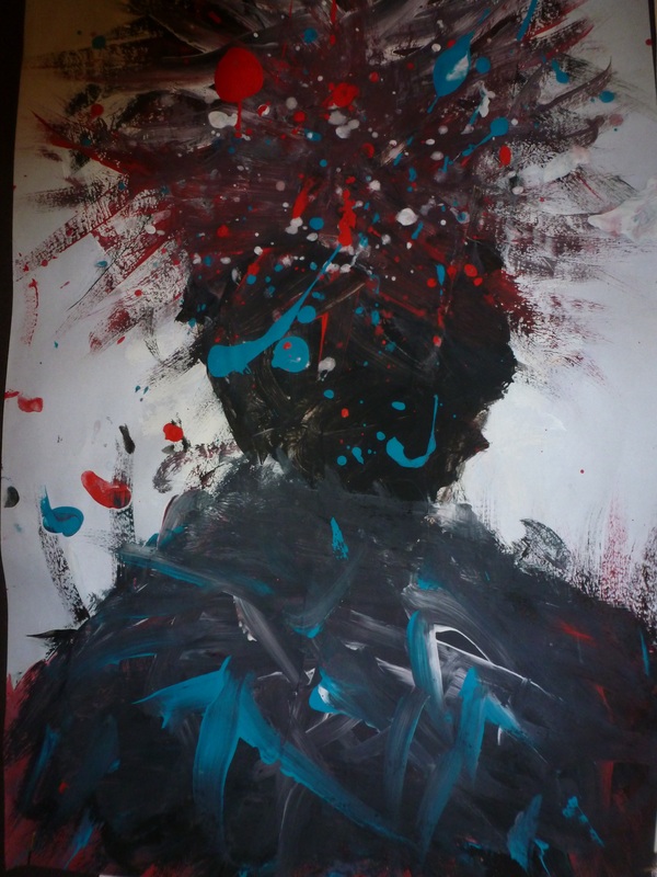
We took influence from the work of the contemporary artist Russ Mills. We discussed how the marks showed action which combined with the colours portrayed emotions. The students were then given the limited palette of turquoise blue, red, white and black to create these images to express an emotion of their choice. This was a really interesting piece of exploration for the students.
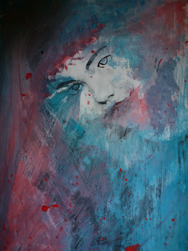
To contrast that use of mark and media we explored how Chrissy Angliker used dripping paint in her 2011 work. We were interested in the lack of control that we had with the watery paint and ink in comparison.
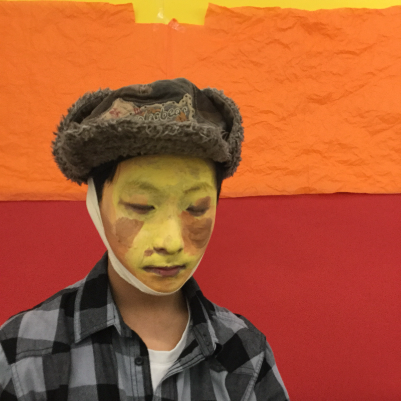
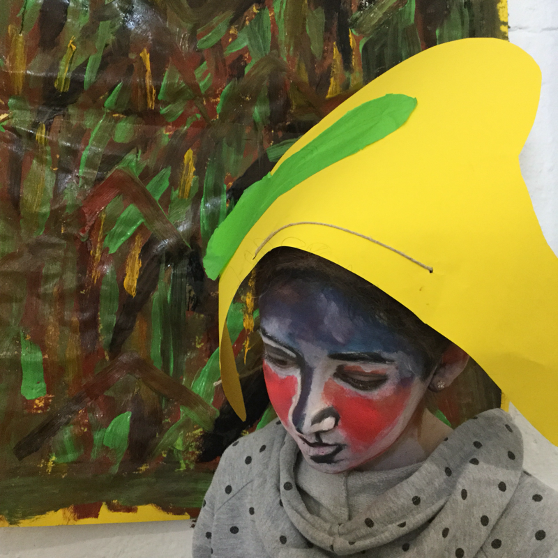
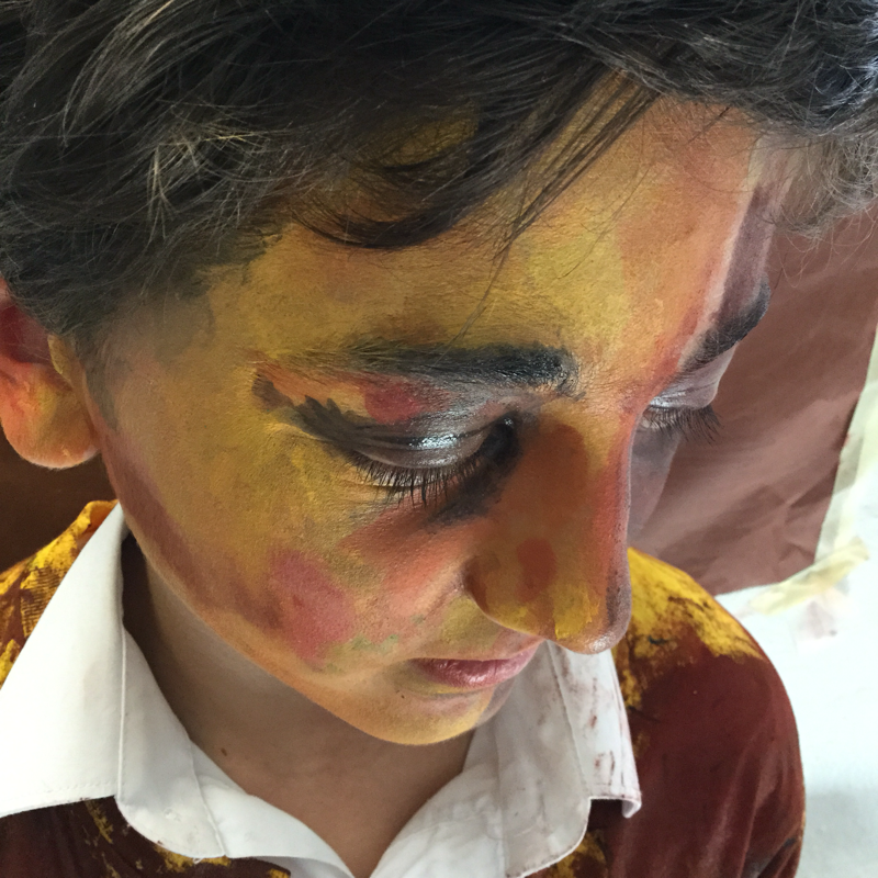
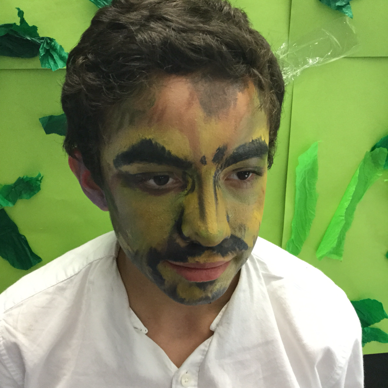
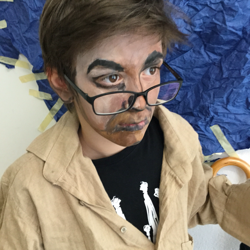
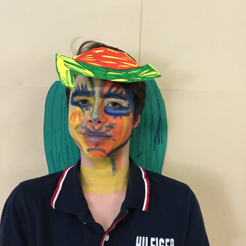
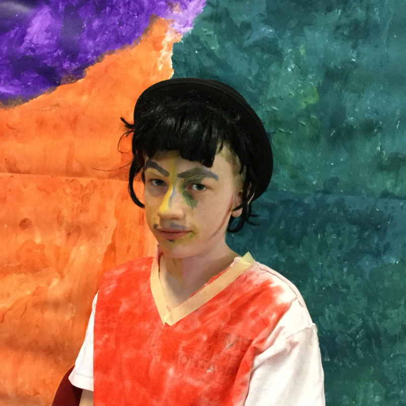
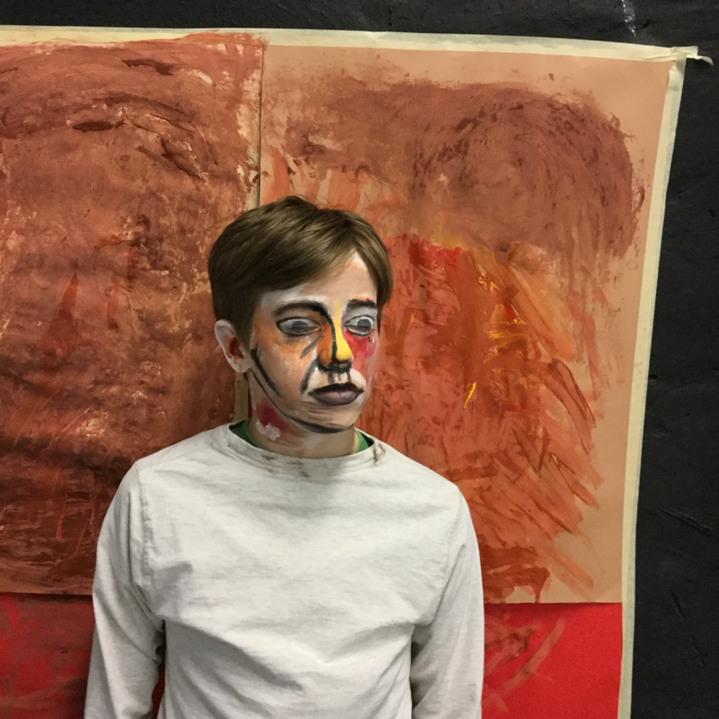
What do the ways cultures conceal themselves reveal? Each student was allowed to choose a culture to research. What were the masks used for? What of? By who? This research influenced their designs, we wanted to create masks that would not look out of place with other masks of that culture. This was an introduction to water colour and working in layers. They then picked out details with pencil crayons.
Grade 7 BBIS: Berlin, Germany.
Conceal and Reveal 2015
I liked this unit last year, but felt like I wanted to update it. I decided that the students would work with oil pastel and sgrafitto, to better replicate the scarification marks that we discuss. This part always really engages them- perhaps because it is quite gruesome, perhaps it is so different from their perceptions of how to show identity within a culture.
I was really impressed with the students attitudes in this unit and think that they were able to produce some excellent results!
I was really impressed with the students attitudes in this unit and think that they were able to produce some excellent results!
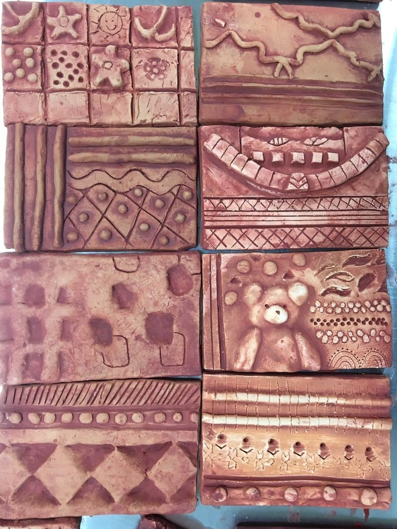
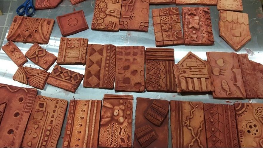
WHAT CAN I LEARN ABOUT OTHER CULTURES FROM THE TEXTILES THAT THEY PRODUCE?
This is one of my favorite units to teach, as it gives the students a chance to explore their heritage or other places around the world. Autonomy plays an important role in the success of this unit. The students are able to choose what to focus on and develop a better connection with their work.
This is one of my favorite units to teach, as it gives the students a chance to explore their heritage or other places around the world. Autonomy plays an important role in the success of this unit. The students are able to choose what to focus on and develop a better connection with their work.
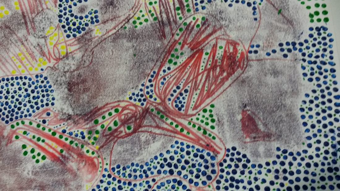
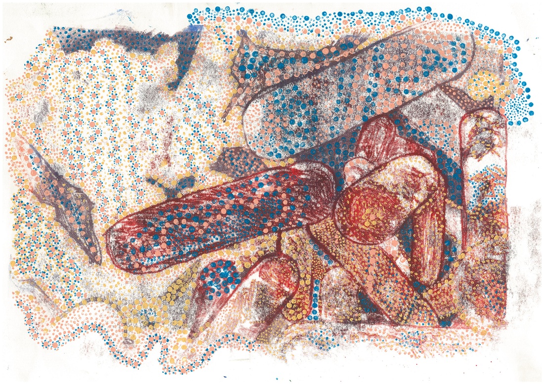
Black and White Design Sheets  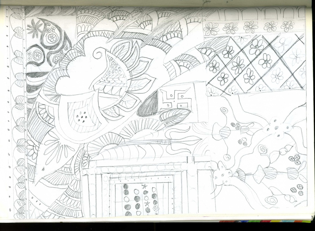 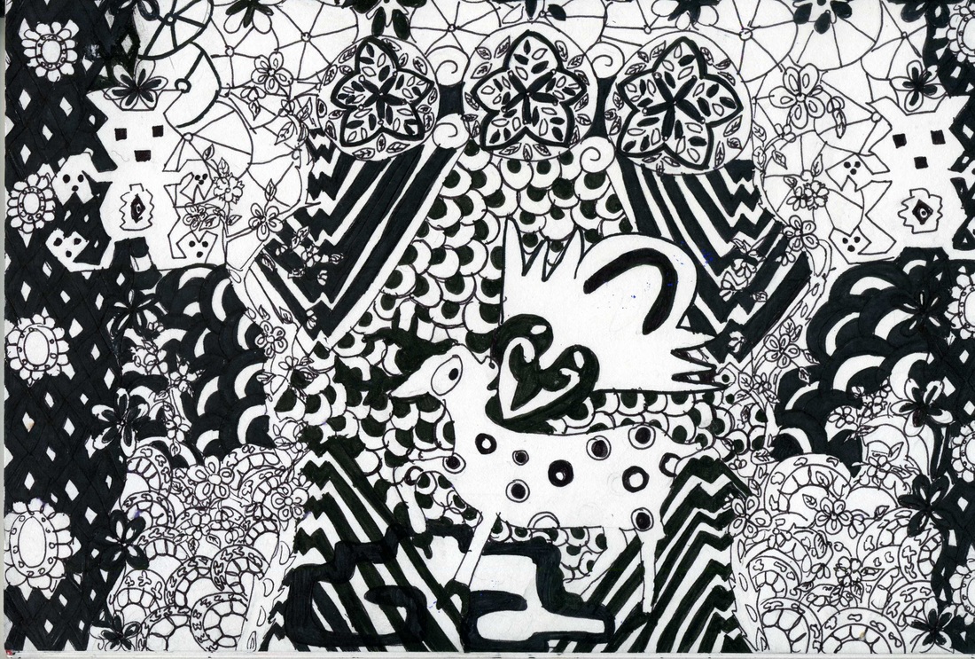 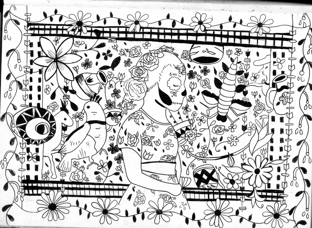 |
Cultural Relief Reduction Prints |
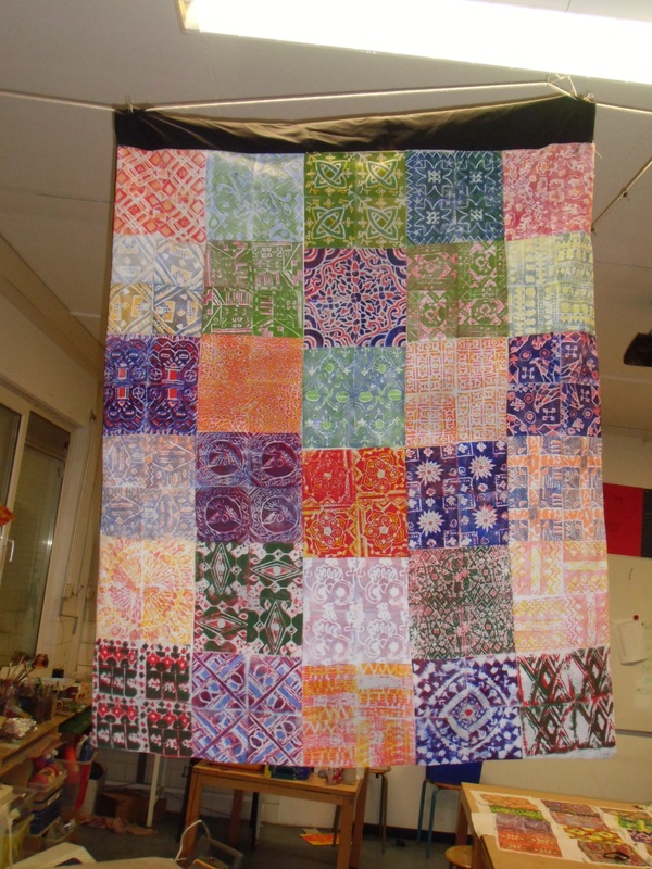
Grade 8 BBIS: Berlin, Germany
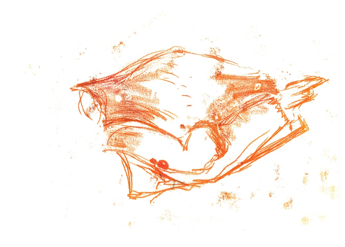
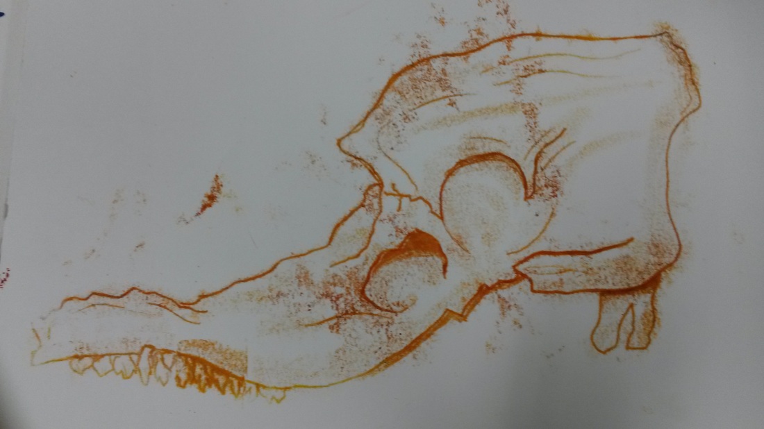
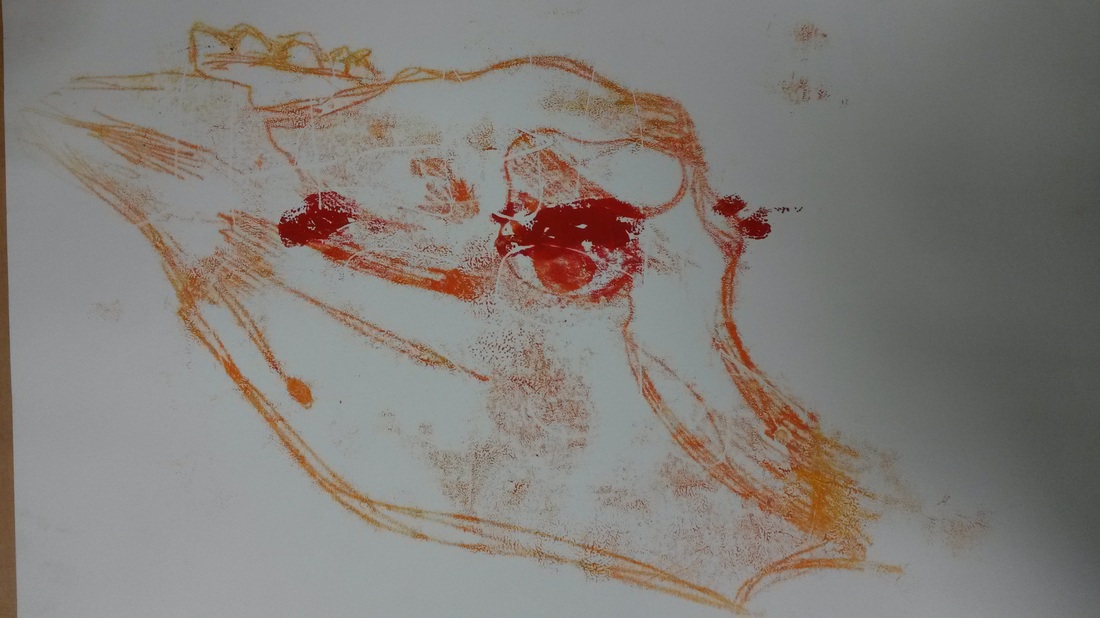
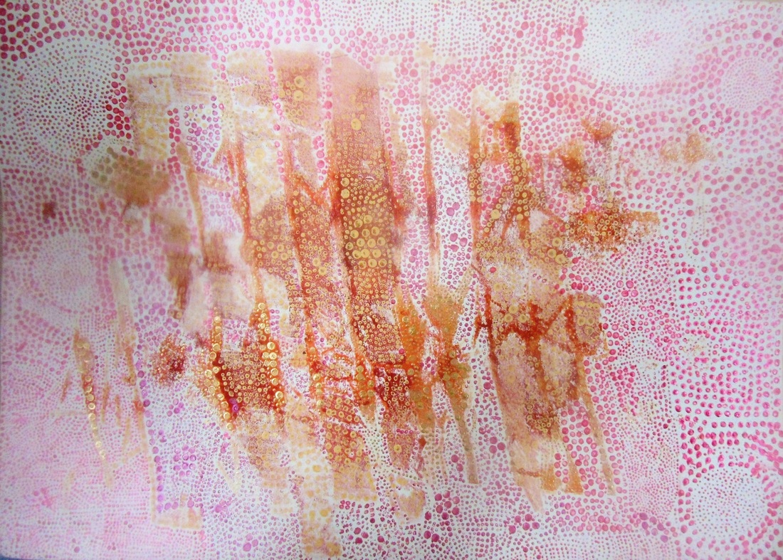
Skull Monoprints.
Observational drawing of skulls.
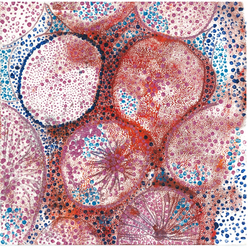
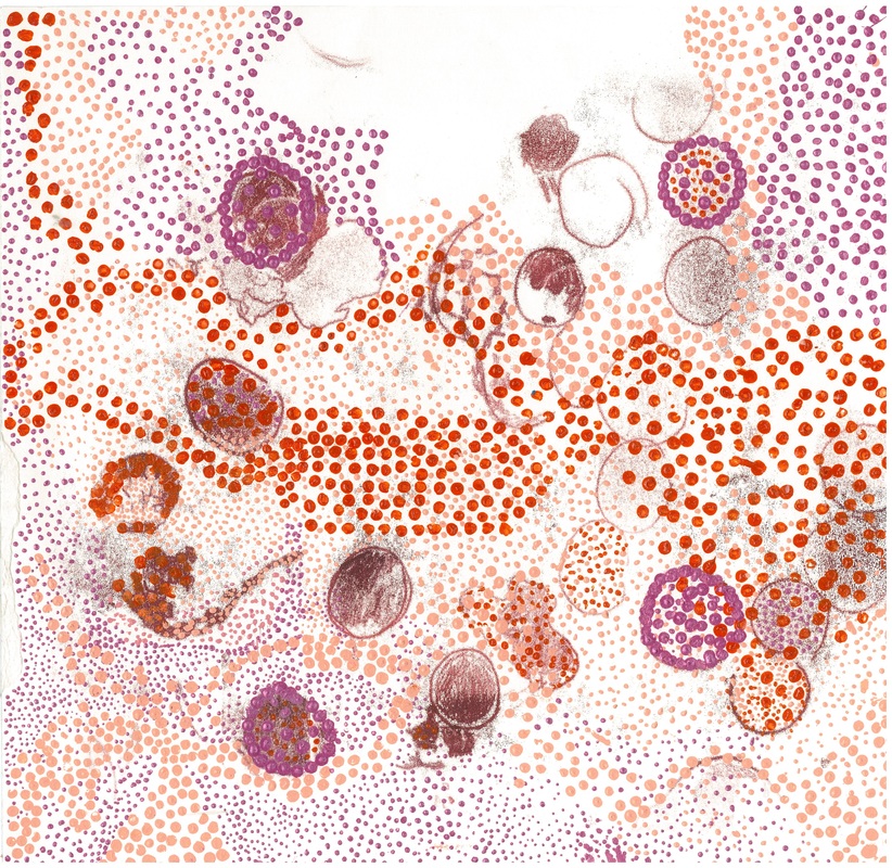
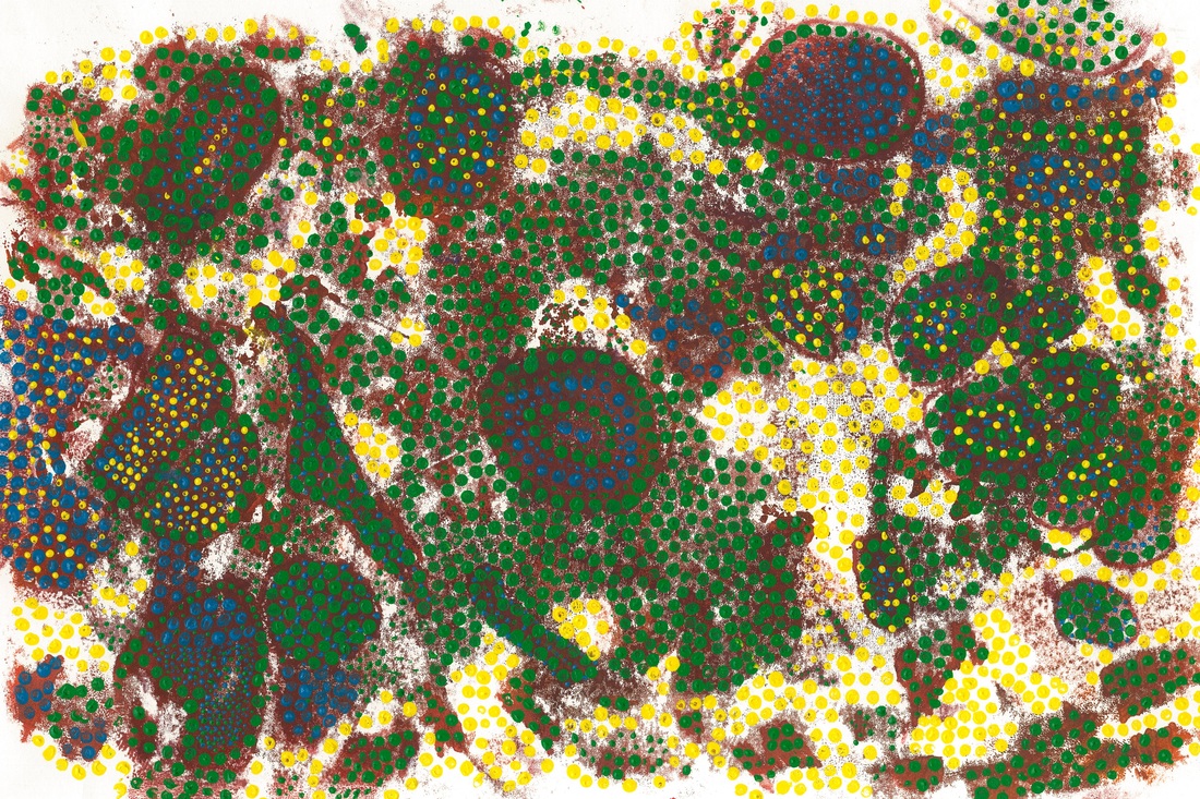
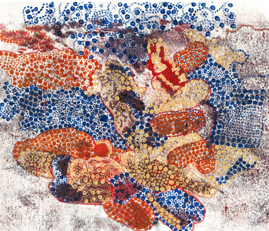
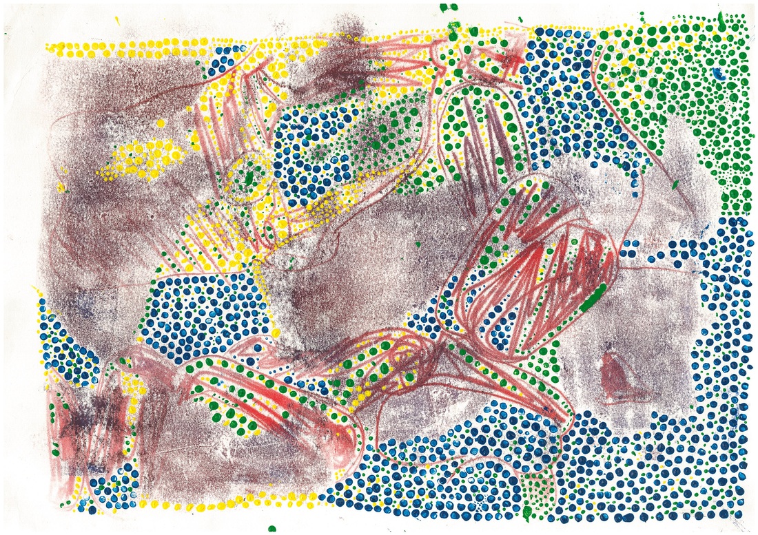
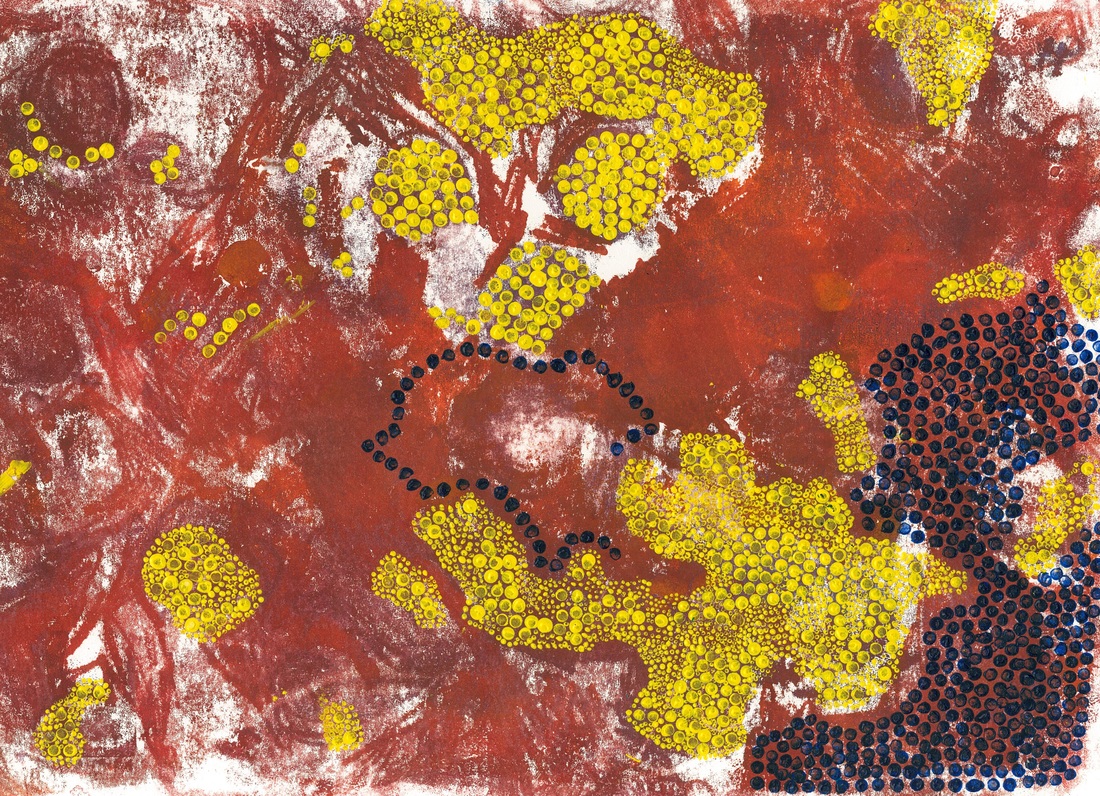
BBIS: Grade 8
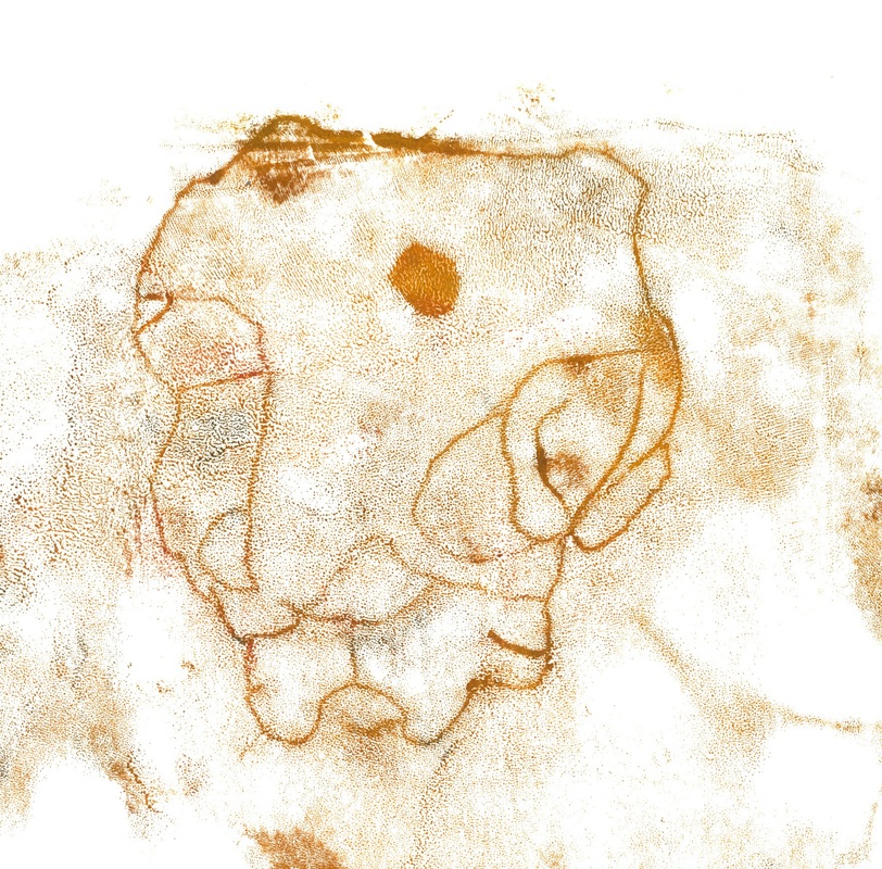
Cells Mono-Prints
Zum Bearbeiten hier klicken.
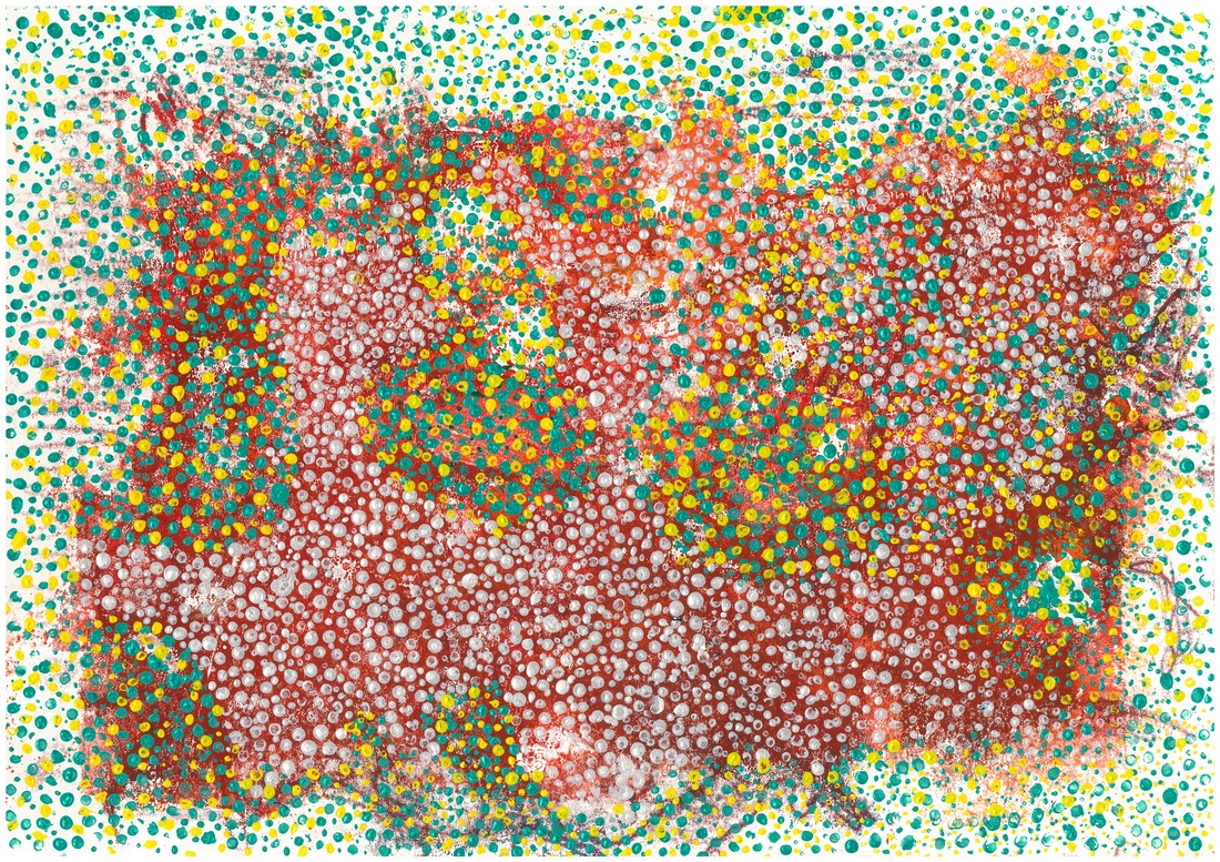
Grade 8 BBIS: Berlin, Germany.
A Window for Understanding
Can I depict myself in the context of culture, personality and values?
The task was to produce a piece of propaganda that promoted a positive aspect or tried to change a negative aspect of your culture. It was an opportunity to learn more about the world these students came from and how they interacted with the world around them, as well as learn about how to create a good poster.
The task was to produce a piece of propaganda that promoted a positive aspect or tried to change a negative aspect of your culture. It was an opportunity to learn more about the world these students came from and how they interacted with the world around them, as well as learn about how to create a good poster.
Grade 7 BBIS: Berlin, Germany.
GETTING TO KNOW YOU.
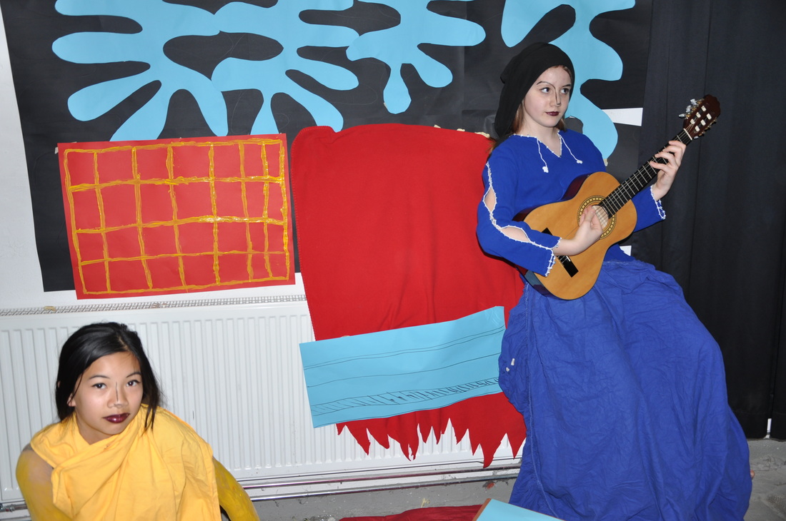
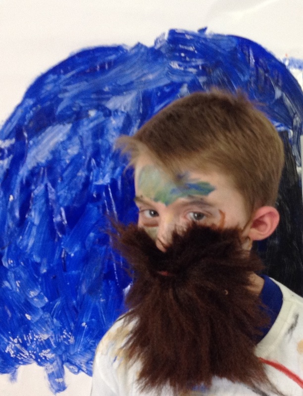
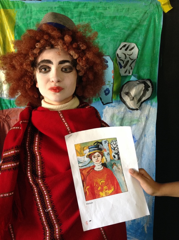
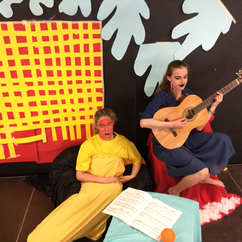
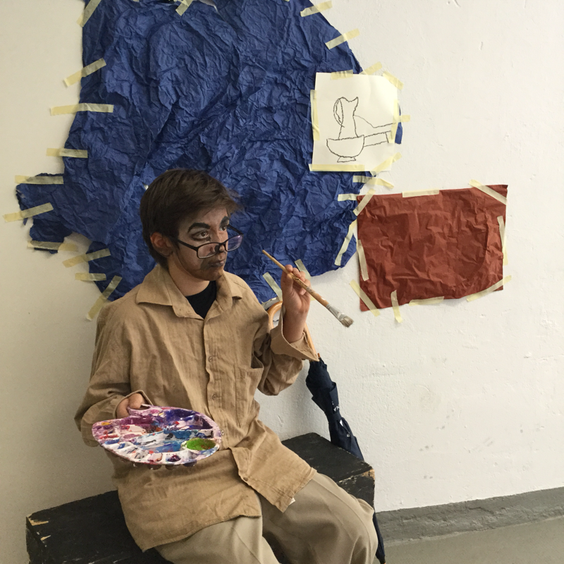
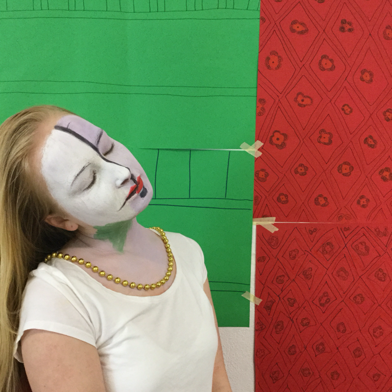
This unit was a cross curricular unit with French, Spanish and EAL. We went to the exhibition of Picasso, Matisse and Klee. I really enjoyed being able to connections with these other departments.
A collage portrait of the artist, in the style of the artist.
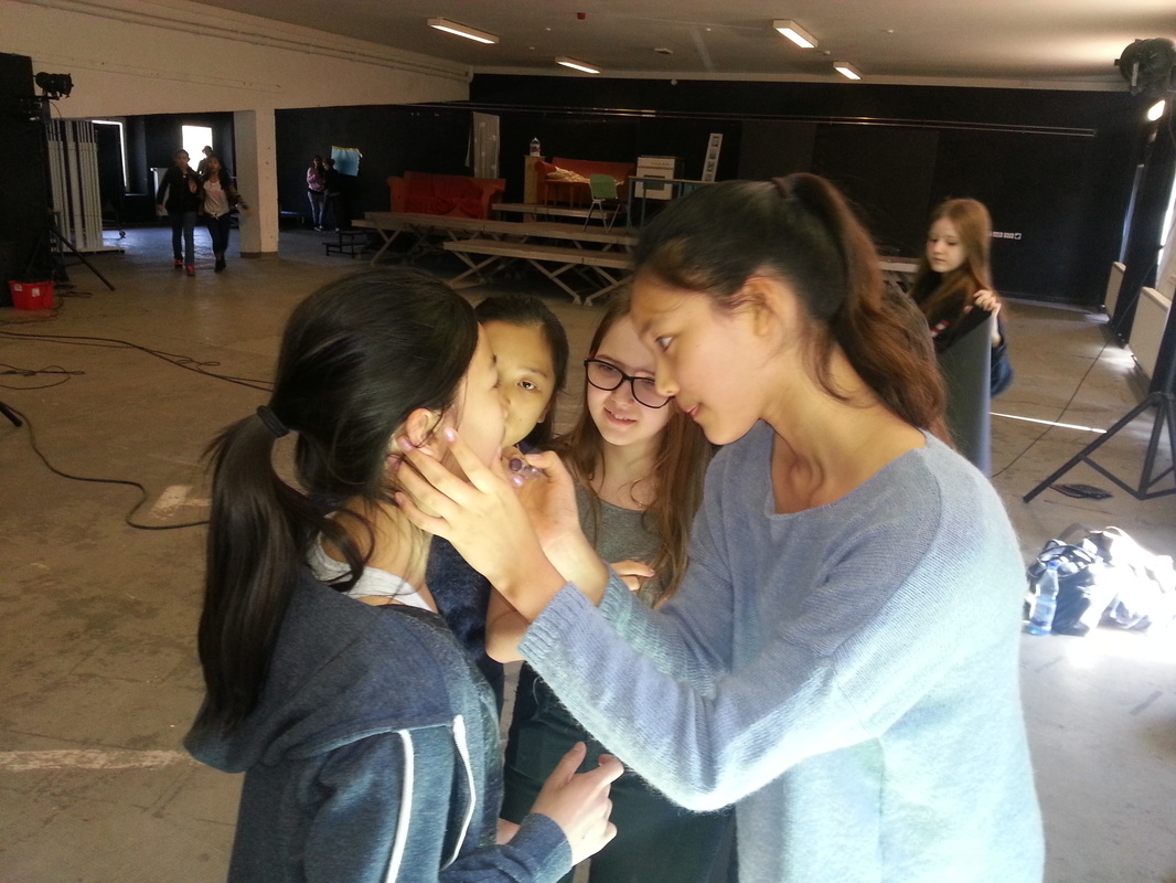
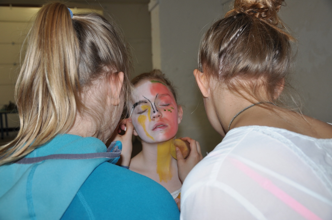
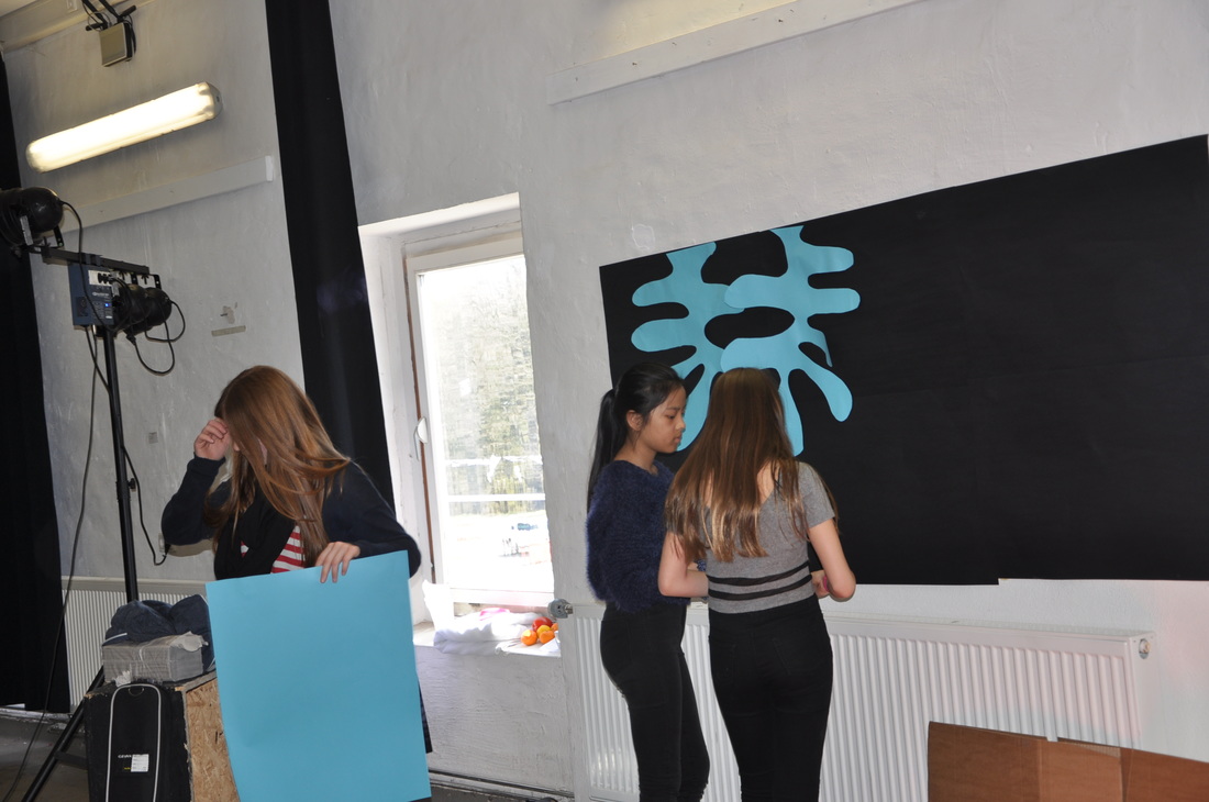
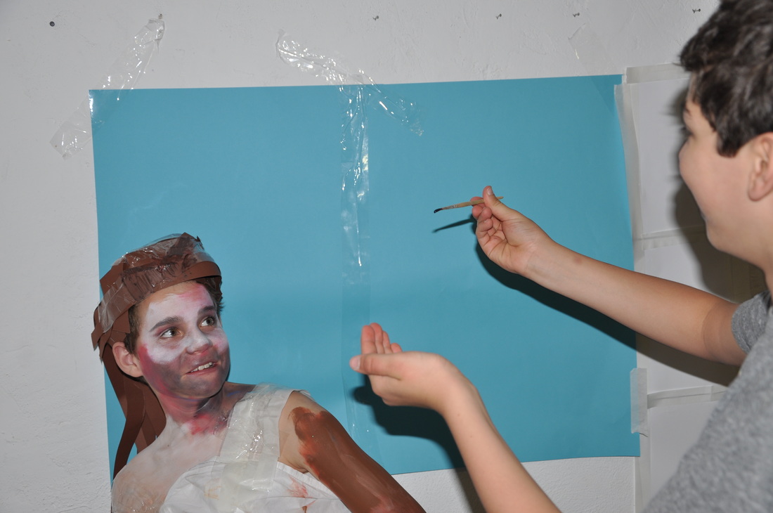
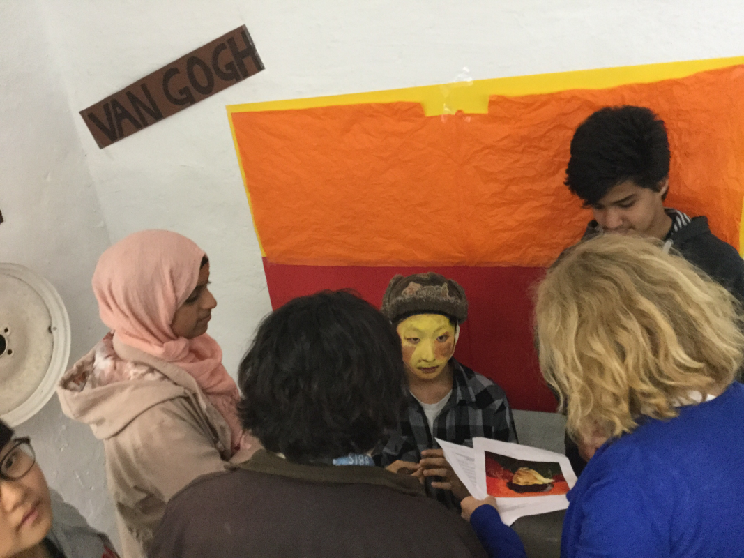
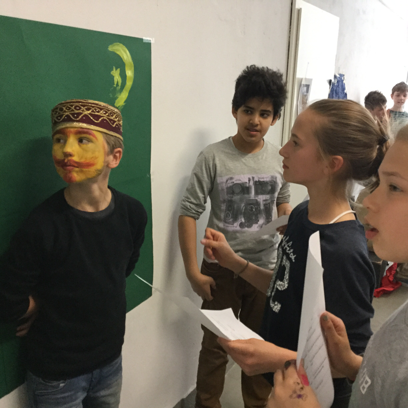
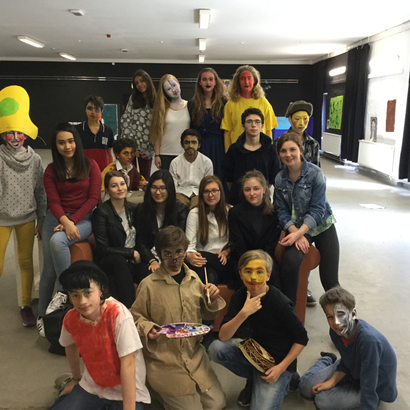
Living Portraits
This was one of the craziest and most fun days! I loved it! As a continuation of the project above, and part of Hispanidad and Francophonie. The grade 7 classes collected all the resources for the living portrait and then a group of grade 10 students came over to paint the work and of the artists, and it was great to see them all collaborate.